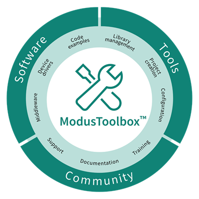
The

Graph View

displays graphs for the sensors selected in the

Widget Explorer pane

.


../figures/image34.png

The following graphs are available:

  • Sensor Data

    – Displays RawCount and Baseline. Click a corresponding check box to see them. Under Multi-frequency mode, RawCount and Baseline are available for three channels: 0, 1, 2.

  • Sensor DiffCount

    – Displays signal differences.

  • Status

    – Displays a sensor status (Touch/No Touch).

  • Position

    – Displays touch positions for the Linear Slider, Radial Slider, and Touchpad widgets.

Note:

For 5th generation CAPSENSE™ configuration with enabled Multi-frequency mode, there is a Median graph on the Sensor Signal graph for each sensor. For Multi-frequency mode, three varieties are scanned for each sensor at three different frequencies and three different raw-counts are obtained for the same sensor. The sensor state is estimated by one median value calculated from the obtained three raw-counts. A Median graph shows a set of F0 values received from a kit. The graph becomes visible if at least one of the graphs F0, F1, F2 is visible. Then, the Tuner calculates the actual value of F0 from received data.

Graph View tab toolbar

Go to

Tabs toolbars

table to see the descriptions of the

Graph View

tab toolbar.

  • Chart settings

    – Opens the menu for editing the chart line series parameters.


    ../figures/image35.png

    • Crosshairs

      – Consists of two lines parallel to the coordinate axes. The vertical component always shows the X coordinate of the mouse cursor and moves with the mouse pointer synchronously on all four charts:

      Sensor Data

      ,

      Sensor Signal

      ,

      Status

      , and

      Position

      regardless of their scale and shift. The horizontal component is visible only on the chart (active chart) over which the mouse cursor is hovering. The

      Crosshairs

      context menu has many more options:


      ../figures/image36.png


      ../figures/image37.png

  • Vertical marker lines

    – When you left-click, the Tuner adds a Vertical marker line with a value equal to the X coordinate of the mouse cursor synchronously on all four charts – Sensor Data, Sensor Signal, Status, and Position regardless of their scale and shift. Press the [

    Esc

    ] key to erase all previously drawn Vertical marker lines. You can change the characteristics of Vertical marker lines or disable them in the submenu

    Chart settings > Vertical marker lines

    .


    ../figures/image38.png


    ../figures/image39.png

  • Stopping bars

    – When performing

    Stop communication

    , the Tuner adds a rectangular mark after the current endpoint synchronously on all four charts. After a new start of communication, new chart points will be added after the last Stopping bar. You can change the Stopping bars characteristics or disable them in the

    Chart settings > Stopping bars

    submenu.


    ../figures/image40.png

Graph functionality

The Graph functionality includes:

  • Highlighting

    – If you click a sensor line series on the graph, the corresponding sensor series highlights on the Legend pane. Likewise, if you click a sensor series on the Legend pane, it highlights a sensor line series on the graph. To highlight lines for all graphs at the same time, press and hold the [

    Ctrl

    ] key. To select multiple sensors in the other View tabs, press and hold the [

    Alt

    ] key.

  • Pan

    and

    – Allow you to examine graphs in more detail. Use a mouse drag for pan. Press and hold the [

    Shift

    ] key to select the area you need to examine. Press and hold the [

    Ctrl

    ] key to examine all the graphs simultaneously.

  • Use the mouse wheel for Zoom. The [

    Ctrl

    ] key + mouse wheel zooms all graphs simultaneously. Press the [

    Esc

    ] key to undo zoom and pan for all graphs.

  • Context menu – Provides the options to change the appearance of graphs. To display the menu, right-click one of the charts: Sensor Data, Sensor Signal, Status, Position, or the chart's legend. The context menu options are the same as for

    Graph View tab toolbar

    > Chart settings

    : increase/decrease the line width and zoom.

    The context menu for selected graphs also contains:


    ../figures/image41.png

    • Color

      – To change a sensor series color on the

      Legend

      pane, either double-click or right-click the sensor and select the

      Color

      option from the displayed menu. The "Please choose a color for …" dialog displays. You can change the color for the graph lines of the same sensor (widget) on all the charts of the

      Graph View

      and on the Touch Signal Graph of the

      Widget View

      simultaneously.


      ../figures/image42.png

      Select a color and click

      OK

      . To select a color for all the graphs at the same time, press and hold the [

      Ctrl

      ] key while clicking.