Bode plot
The
Bode plot
is a set of graphs that allow assessing a given power conversion design. The graphs are
Gain plot
(magnitude) and
Phase plot
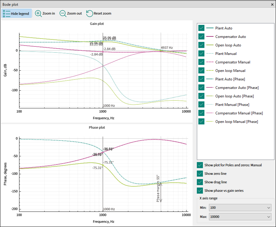
of a transfer function versus frequency. The gain expressed in decibels and phase in degrees are plotted versus frequency using semi-logarithmic axes. A plot set consists of the
Plant
,
Compensator
, and
Open loop
series.
Toolbar
The Bode plot toolbar consists of the Hide/Show legend; Zoom in; Zoom out; Reset zoom commands.
You can also zoom or move a graph using the mouse. With additional modifiers, you can zoom only the X axis (
Shift + Wheel
) or
Y
axis (
Ctrl + Wheel
).
Legend
The
Legend
provides an explanation of displayed graph data and allows for the customization of this information. Select a respective option in the
Legend
, to display the various subsets of series.
The following options are available:
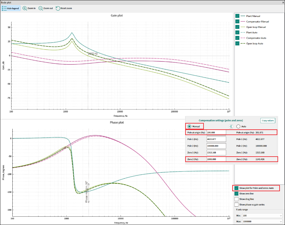
Show plot for poles and zeros
– Check this box to compare the output for the manual and auto compensation settings. If the respective manual and auto compensation settings values are not equal, the series will not overlap, and an alternative set with a dash line series can be clearly visible.
Show zero line
– Enable this option to reveal a vertical static line that indicates the
X
coordinate where the open loop series intersects with the 0 dB
Y
axis value, as well as the target Phase margin.
Show drag line
– Enable this option to display a vertical draggable line that presents the values of the bode plot series at their intersection with the line at a certain frequency. This line can be moved using the mouse or, if it is beyond the
X
axis range, to make it visible, double-click the chart area.
Show phase vs gain series
– Check this box to additionally showcase the phase series on the
Gain plot
. The label [
Phase
] will be included in the legend for differentiation.
The
X-axis range
remains consistent for both the
Gain
and
Phase
plots and can be modified by selecting the desired min and max values from the dropdown menus. The widest available range spans from 100 Hz to 1 MHz The Y-axis range adjusts dynamically to ensure the visualization of all series.